The ultimate bubble blowers
There are many reasons asset bubbles create agonizing hangovers but one of the most pernicious relates to debt. You may have heard of the neutron bomb where the people are gone but the buildings remain. Apropos to bubbles, which are often heavily funded by wild borrowing cycles, the assets are eventually nuked but the debt remains. [i]
There is most definitely a very long list of negative effects from twelve years of money for – and from – nothing central bank policies, but none are more harmful than encouraging the leveraging up of pretty much the entire planet. In the pages to follow, I will present a multitude of evidence on the outrageous accumulation of debt that has been very much of a global affair.
The Global Financial Crisis (GFC) of 2008/2009 was assumed to be a peak in reckless credit creation that would not be exceeded for generations… if ever. Its implosion was so intense that it took credit spreads (please recall how vital those are from earlier chapters) to peaks unseen since 1932. As I wrote at the time, stocks got somewhat undervalued in early 2009 but nothing within light years of the kind of bombed-out valuations seen in the early 1930s. But for credit instruments (bonds, mortgages, preferred stocks, collateralized debt obligations), it was de ja vu 1932 all over again.
Yet, as you can see in the following chart, a mere four years after that epic debt reckoning, global debt levels had risen well beyond those seen during “the bubble to end all bubbles”. Now, twelve years removed from it, we’ve taken that number up by another $130 trillion, as you can see in Figure 1. That’s “only” about $200 trillion more than the world collapsed under in 2008. Maybe, just maybe, these reckless central bank monetary policies are the Viagra in this latest wild debt orgy.
Figure 1
Figure 2
The debt trend pre-pandemic was terrifying enough but in its wake the slope of the curve went nearly vertical (in calculus speak, almost undefined). In the case of our Federal Reserve, it was fabricating roughly $1 trillion per month during the worst of the crisis. Other central banks were also in hyper-print mode but the US definitely was the leader in the clubhouse—and is still winning the tournament—when it comes to monster stimulus payments nearly all funded, directly or indirectly, by the Fed.
Figure 3
As noted at the outset of this book, in the wake of the GFC government spending initially spiked but, shortly thereafter, it began to level out. In fact, as a percentage of GDP it actually fell through most of the Obama administration’s term. The fiscal response to Covid, however, has been the antithesis of austerity. (Tea Party, where have you gone?)
Figures 4 & 5
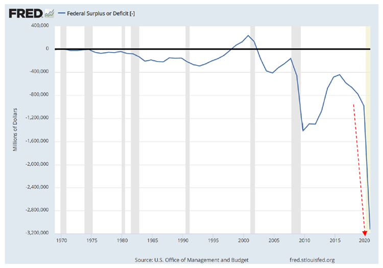
Unquestionably, this has been a joint crisis response. In other words, unprecedented monetary stimulus (cutting interest rates and printing trillions) combined with equally unprecedented fiscal stimulus (the two biggest annual post-WWII budget deficits). It’s how the U.S. government turned the deepest recession since the 1930s into the shortest recession ever. But the legacy for future generations is the extreme indebtedness seen below. (show US fed debt chart from 7/21 Luke Gromen) We also need a chart showing debt levels not just deficit; it should be in the same issue)
Figure 6
Just to recap how mammoth the U.S. government’s spending and debt accumulation has been, let’s review the numbers as of 9/30/2021. Over the last two mostly Covid impacted fiscal years, the federal government spent $14 trillion, or about $7 trillion per year. This was about $6 trillion more than its total revenues; accordingly, the 2020 deficit was $3.1 and 2021 was only $300 billion less. The next closest was a $1.2 trillion shortfall during the Great Recession/GFC era.
The remarkable aspect about the $2.8 trillion fiscal year (FY) 2021 deficit, which ended on September 30th, was that it coincided with another “largest ever” — in this case, government revenue intake. That’s not a typo. In FY ’21, the treasury brought in over $4 trillion in revenue, up 18% from 2020. Since Covid impaired the government’s receipts in 2020 that’s not totally shocking. But FY 2021 was also up nearly 15% from the virus-free fiscal year 2019! Yet, despite that remarkable resilience in tax receipts, the red ink was approximately 70% of total federal revenues.
Of course, these stunning deficits manifested themselves in equally stunning debt accumulations. When it comes to the US government, deficits and debts are joined at the hip, perhaps the right hip. Affixed to the other hip is the Fed’s balance sheet. That’s where all the securities it buys wind up, acquired with the digital reserves it creates from its Magical Money Machine (literally, its computers that buy mostly government debt from the Wall Street primary bond dealers such as JP Morgan). You can see how closely that balance sheet impregnation has tracked the U.S. government’s torrents of red ink.
Figure 7
In the distant past, like the 1950s, one dollar of additional government debt translated into over seven dollars of economic growth (possibly, because this was during the Eisenhower build-out of the interstate freeway system with its massive productivity enhancements). In other words, in the ‘50s there was a powerful positive multiplier on each marginal dollar of debt. Today, however, the multiplier has gone negative; each incremental dollar of debt produces just 70 cents of increased GDP. Consequently, since around 2007, GDP has grown far less than federal debt outstanding. (show Blackstone charts or ones like them plus one of the cumulative change in GDP since 1968) I’m not sure where to find these! G, can you grab a chart, maybe from the Fed, that shows the increase in fed debt and GDP since 2007?)
This is the classic definition of a debt trap. A country can’t keep growing what it owes faster than its total economic output indefinitely… though the U.S. is giving it its best — or worst — shot these days. It is noteworthy that the first time the multiplier went negative was right around the time of the housing boom and bust.
That period saw immense amounts of borrowing to buy unproductive assets (overpriced homes). Said differently, it was a multi-trillion exercise in capital misallocation. That bubble’s demise not only destroyed vast amounts of wealth it also set off the chain reaction of increasingly desperate Fed policies to prop up the system, as noted at the outset of this book. Covid merely intensified the trend of money fabrication run amok already in place.
As Charles Gave has often written, debt-funded financial engineering — be it to do leveraged buyouts of companies (LBOs) or to issue myriad amounts of sub-prime mortgage debt to inflate a housing bubble — is bad for productivity. This would also include the unparalleled surge in buybacks, per Chapter 13. Because financial engineering has gone viral over the last two decades, it’s unsurprising that productivity has been in a long bear market. It’s also no shock that economic growth has been consistently disappointing since the turn of the millennium, as I’ve previously observed. (We will see shortly, this has deviated from a growth trend in place since the end of the Civil War).
Figure 8
There is also a correlation between high levels of government spending and deficient productivity. One reason for this link is that eventually inflated levels of federal expenditures lead to higher taxes. (Another critical aspect is that the government is notoriously a less efficient allocator of capital than the private sector, especially, when as shown in Figure 8 above, most of the spending is on social transfers that often discourage productive endeavors, aka, work.) The Organization for Economic Cooperation and Development (OECD) has found that a 1% increase in a country’s tax rate leads to a 1.4% drop in hours worked per capita in the working age cohort. As the late Ed Lazear, former chairman of the President’s Council of Economic Advisers from 2006 to 2009, wrote in a February 2018, Wall Street Journal Op-Ed: “US data dating to the 1970s also shows that higher taxes cause workers to limit their hours, reducing economic output.”
Sophisticated studies really aren’t necessary because you can simply look to heavily taxed Europe to see a graphic example of the drag caused by punitive tax rates. In the U.S., hours worked were nearly double the tax ratio to GDP whereas in France hours worked were only about 75% of the tax ratio to GDP. As Professor Lazear went on to note in his Op-Ed, “The international comparisons suggest that a 4% increase in (government) spending associated with a decrease of roughly 0.5% in the average annual growth rate.”
Figure 9
Since 2000, America has become increasingly European when it comes to government spending and deficits. It stretches credulity to believe it was a coincidence that from 1870 through the 1990s U.S. per capita GDP was 2.2% per year and, since then it has been halved to 1.10% per year. It’s further unlikely it was mere happenstance that the beginning of the 21st century ushered in an era of frantic monetary policies in the wake of tech’s spectacular splashdown, causing the aforementioned growth buzz-cut. While a 1% per year growth shortfall doesn’t sound that meaningful, over time it has compounded into a 26% reduction in the size of America’s economy.
The reality is that the GOP is every bit as much to blame as the Democrats for this sad outcome; even more disheartening, the future is bleak. U.S. debt-to-GDP is projected to be 195% by 2050 up from an already extremely dangerous 125% in late 2021. Moreover, this excludes the unfunded entitlement overhang described in Chapter . As a disquieting reminder, those are estimated to be in the neighborhood of $160 trillion, according to the reigning King of Bonds, Jeffery Gundlach.
Figure 10
To put the enormity of this number into context, please refer to Figure 11 showing total global debt to be $300 trillion. (Admittedly, that could be underestimated in other nations, especially the eurozone, for much the same reason as in the U.S. — bogus government accounting.) Even using the official, much more charitable, aggregate liability number, federal debt per capita has rocketed from $69,000 to $82,000 since Covid graced us with its presence.
Figure 11
It is this deepening debt trap that has caused Lacy Hunt, also one of the most acclaimed bond managers of all-time, to believe inflation and growth are going to remain muted as they have for the last two decades. This is because he has reviewed extensive academic studies showing that high levels of government spending clearly hurt growth, highly consistent with what both Professor Lazear and Charles Gave have determined, as well.
This is a politically contentious issue, of course, with many, mostly on the Left, such as Paul Krugman, strenuously disagreeing. Yet, it’s hard to blow off the flaccid results we’ve had over the past two decades as we morphed from running budget surpluses in the late 1990s (under a Democratic president, by the way) to increasingly monstrous deficits in the 2000s. Again, what’s happened in Europe over the same timeframe also argues emphatically that exploding government spending and deficits is growth inhibiting, not accelerating.
Nevertheless, Western policymakers seem intent on doubling, or even tripling, down on borrow and spend tactics. In reality, instead of borrowing the old-fashioned way via the bond market, the primary go-to funding source in the post-financial crisis era has become the central banks new-age printing presses. As I’ve explained before, this is debt monetization and process once believed to be the domain of developing world countries that were in the process of reverse development, such as Venezuela and Zimbabwe.
Returning to the thesis that excessive government spending is economically sedating, for the first time more than half of all Americans are receiving some type of government check. Much of this is in the form of unemployment benefits, particularly during the virus crisis. Initially, this was the rational and humane course of action. However, it became clear as early August of 2020 that these overly generous benefits (in many cases) were creating a labor shortage. As 2021 progressed, that has become increasingly and more undeniably obvious. In fact, I believe it is fair and accurate to say that the U.S. economy has never faced a worker shortage as acute as we are seeing at this time. Worryingly, this appears poised to hit a crescendo as vaccine mandates begin to be implemented as I write these words.
In my 42-year career of working with thousands of affluent to highly affluent Americans, very few of them deny the need to aid those who are handicapped or impoverished children. However, the kind of absurd federal outlays that have characterized the pandemic recovery era are almost certainly a big factor behind the Democratic party’s shocking popularity plunge in the fall of 2021. For example, the highly contentious Build Back Better act, which is still lingering out there somewhere in legislative limbo, provided paid family leave for up to 12 weeks per year. Married couples earning as much as $400,000 combined could potentially receive $24,000
Similarly, the bill sought to expand ObamaCare benefits. These would provide a household earning as much as $350,000--in a moderate-income region such as Prescott, Arizona – the ability to receive an ObamaCare subsidy of $21,309. Also, on the bankrupting of America via uncontrolled healthcare spending front, 37% of Californians, or almost 15 million people, are on Medicaid, a program meant to provide a healthcare safety net to the truly poor. (If that’s actually the number of destitute people in the so-called “Golden State”, it certainly doesn’t reflect well on forty years of a consistently intensifying leftward lurch in its politics.)
In days gone by, a sizeable percentage of the America’s sovereign funding needs were met by overseas investors. In the 1970s, OPEC was among the biggest buyers of treasuries, as it recycled its billions (back when a billion was real money) of petrodollars into the U.S. In the 1980s, it was Japan that took the lead in this regard, redeploying its surging trade surpluses back to its main customer’s bond market (and, of course, into trophy real estate on which it often grossly overpaid, leading to huge eventual losses). By the 1990s, America’s trade deficit with China was going vertical. In this case, it would last for much more than a decade and China quickly rose to second, only behind Japan, as the largest holder of U.S. treasuries.
Starting around 2013, however, a funny thing happened. As U.S. cumulative federal indebtedness was in the process of doing a moonshot from around $15 trillion then to $29 trillion today (i.e., nearly doubling what had taken 237 years to amass!), foreigners decided to mostly sit on their hands. Though their treasury holdings rose by a couple trillion or so, the other $13 trillion needed to come from somewhere else. As we’ve seen, that somewhere else has mostly been the Fed, courtesy of its magical money machine.
Figure 12
This is a dramatic change indicating growing international unease with the prospects of getting repaid, at least in non-debased dollars. Considering the rate at which dollars are being created these days, that’s a most understandable reluctance.
Another reason foreign investors are edgy as they appraise America’s ability to service its debts and maintain the integrity of the U.S. dollar, is the other deficit — as in, trade. Back in the 1980s, there was tremendous angst over our “twin deficits” under the Reagan Administration. While those days are looked back on fondly as an economic nirvana, the rapid GDP growth seen that decade coincided with soaring federal budget and trade deficits — the “terrible twins”.
However, the handwringing over this not-so-dynamic duo turned out to be misplaced. As noted above, by the latter years of the 1990s the U.S. moved into a budget surplus status, shocking everyone. By the end of that decade, the black ink was growing so rapidly that then-Fed chairman Alan Greenspan fretted before Congress that there might not be a treasury bond market by 2010 because the government was on track to retire all its debt by then! Suffice to say, it was another way off the mark forecast by a leader of the Fed, a proud tradition that has been maintained in the 21st century.
What’s especially shocking about the current $1 trillion US trade deficit is that it’s happening despite America having effectively eliminated its once massive oil importation expense. Without the unconventional oil revolution, which has allowed America to be “energy independent” for the first time since the 1960s, our trade deficit would be almost $200 billion, or 20%, higher. Of course, presently, there isn’t lot of love flowing between Washington, D.C., and the prolific Permian Basin that straddles Texas and New Mexico. Rather, the Biden Administration is restricting U.S. oil output, as noted in Chapter 9, and pleading with OPEC to increase output. This bizarre stance is likely another factor in the drastic plunge in President Biden’s approval rating… along with spiking energy prices of all types.
But, per the main theme of this chapter, it’s becoming increasingly clear that Americans, including moderate Democrats and Trump-loving GOPers, are exceedingly alarmed about the fiscal condition of our nation. Even though the stock market kept making records in late 2021, there was an underlying sense of unease with the artificiality of this boom, which desperately depends on ever greater amount of debt and the avoidance of a deleveraging cycle at all costs. (The latter because of the severe deflationary implications such as those seen during the housing bust.)
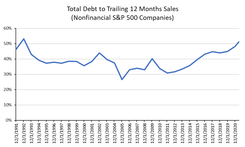
Though the average voter may not have access to the precise statistics, they sense that Corporate America is playing a dangerous game with its affinity for leverage and share buybacks, as we saw in Chapter 12. For those readers who are also not aware of how debt-drenched U.S. companies are, the two charts below are illuminating.
Figures 13 & 14
Perhaps the most interesting way to look at how levered-up U.S. corporations have become is shown below. This view is one I very rarely come across but it’s equivalent to the price-to-sales ratio in the stock market, which has one of the best track records in revealing under- and overvaluation. It is, basically, a debt-to-sales metric and it is clearly flashing red.
Figure 15
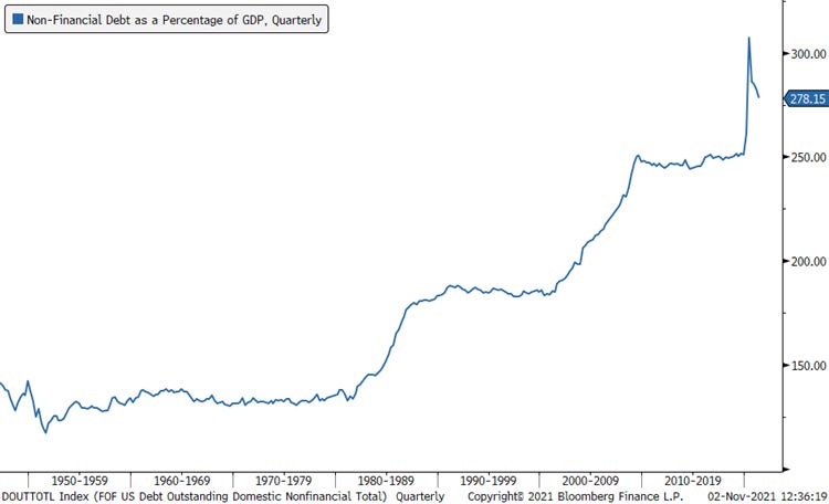
Looking beyond just Corporate America, the USA’s overall non-financial debt (i.e., this exclude the banking system which would lead to double- and triple-counting of liabilities) is at record levels. For sure, other countries are even worse though I’m not sure that’s particularly comforting when it comes to the soundness of the global financial ecosystem. The other image reflects the degree to which the percentage of companies can’t service their debt — despite extremely borrower-friendly interest rates.
Figures 16 & 17
This brings me to a meme often expressed that puzzles me. Perhaps you’ve read about it too with perplexity--namely, that the reason inflation has been subdued for so long, until this year, is that there is a worldwide savings glut. How can that be given the appalling debt statistics show above? A planet that is sinking deeper and deeper into a debt trap strikes me as coping with the antithesis of a savings glut.
It's fair to say that there are certain components of the world’s economy that are big-time savers. For example, as discussed in earlier chapters, the U.S. consumer has amassed a war chest of about $2 ½ trillion of excess savings since Covid struck. Japanese corporations are another source of bountiful cash holdings, as are Chinese, and most Asian, consumers. However, global governments have run such astronomical deficits for most of the last twenty years—and at an accelerating rate—that they have essentially off-set nearly all of the private sector’s thriftiness. In other words, the next time you hear the words “savings glut”, be very dubious.
Figures 18
A final area of excess indebtedness risks pertains to leveraged loans. This is a non-traded part of the corporate bond market where yield-starved institutional investors, like insurance companies, have become involved to a rapidly growing degree. Even former Fed chair and current Treasury Secretary Janet Yellen has been warning about the mounting dangers in this debt market realm for the past two years. The risks have risen notably since then, but this is what she told the Financial Times in August of 2019: “I am worried about the systemic risks associated with these loans. There has been a huge deterioration in standards; covenants have been loosened in leveraged lending.”
She went on to tell the FT that she feared widespread bankruptcies due to the extensive use of leveraged loans in the next recession. Had the Fed not intervened in the corporate debt markets in March 2020, it’s likely she would have seen her fears realized in less than a year. But that reckoning has been delayed, though certainly not eliminated.
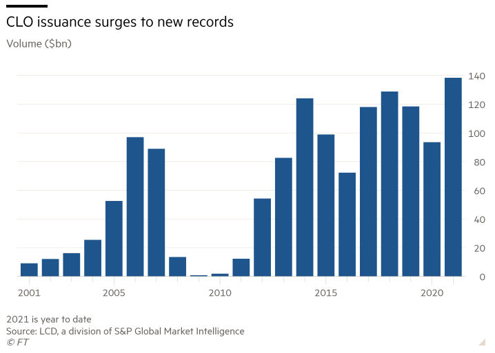
Collateralized Loan Obligation (CLOs), which are packages of leveraged loans, are being created in vast quantities. These are of the same DNA strain as Collateralized Debt Obligations (CDOs) that nearly blew up the entire planetary financial system back in the Global Financial crisis. Like the CDOs of yore, the high-quality slices, or tranches as they are known in Wall Street lingo, are often rated AAA. This is notwithstanding the reality that the underlying loans are typically mostly, if not totally, junk. It was this magic alchemy that essentially destroyed AIG back in 2008 when those AAA-rated CDOs crashed to as low as 30 cents on the dollar. (Please see Chapter for a refresher on that fiasco… if you can stomach it.)
Figure 19
There are yet more echoes of the reckless lending and overzealous borrowing that characterized the years leading up to the GFC. Zero-down sub-prime mortgage have made a comeback; lowly rated auto loans are selling like hangover treatments in Vegas on a Sunday morning; and three-quarters of commercial mortgages were interest only leading up to the pandemic, the highest since late 2006.
Figure 20
Figure 21
When you step back and consider the totality of the images and factoids presented in this chapter, it’s hard to suppress a high degree of rage over how our policymakers allowed us to do a return trip to crazy land. The worst part is that it’s even more insane today than it was in 2008. How could they have allowed this to happen? Where are the regulators? How could the Fed possibly have acted as such a blatant enabler of the massive leveraging up of the government and the financial markets?
Yes, bubbles are fun on the way up, but they are horrific during the implosion phase. Moreover, the worst kinds of busted bubbles are those that were inflated by immense sums of cheap borrowed money. This is yet another example of how what we’ve been living through in recent years is truly “The Biggest Bubble Ever”. In the next chapter, I’ll unleash even more on the ultimate perp behind this disaster in the making.
[i] What is happening in the Chinese property market in late 2021 is another example of this phenomenon. Leading residential developer, Evergrande, is teetering on the brink of failure as prices and sales have declined sharply yet the company remains on the hook for its immense debts.


