
The Anti-Bubble Years

The birth of another bull
The epic bull run from 1982 to early 2000 was the biggest of all-time. But it wasn’t just stocks that were superstars. The bond market was, in its own way, even more spectacular. Thirty-year maturity treasury bonds bestowed upon the handful of intrepid investors who were willing to buy them at their yield peak in 1981, when they were derisively called “certificates of confiscation”, a per year return of 9.5%. On a risk-adjusted basis versus stocks, they actually beat the S&P 500 by 1.5% annually. (Bonds are less volatile, or risky, than stocks and, thus, are expected to have a lower return but with much milder fluctuations; this calculation makes that adjustment.)
There is no doubt the collapse in yields during the period from 1982 to 2000 turbo-charged the great equity bull market. This was despite the fact that long-term treasury bonds were still yielding around 6% in March of 2000 when the nearly 18-year bull run finally expired. This is in contrast to less than 2% on the 30-year treasury bond at year-end 2021.
Returning to the question of why, for nearly 40 years, I was almost always bullish to very bullish on bonds, it was in no small part due to the fact that interest rates were largely positive even after inflation. As you can see below, there were very few instances during this era, at least until the post-financial crisis timeframe, when real interest rates were not reasonably positive. Consequently, as a bondholder, you actually got paid to hold them, a refreshingly quaint, but also increasingly rare, notion.
Figure 4

Additionally, and similarly, inflation was under consistent downward pressure. There was a multitude of factors through this four-decade period that would keep it in check, if not push it even lower, and I was a believer in their sustainability.
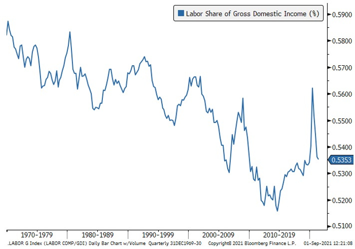
This is a major topic, and it would take an entire book to do it justice, but I will try to summarize what I believe were among the major disinflationary forces. First up, was the decline of union power. It’s a statement of fact that the significant reduction in collective bargaining over the past half-century was behind the trends seen in the chart below. Union membership for the overall U.S. workforce fell from 29% in the 1970s to 11% today. It’s hard to argue this wasn’t behind a shift in the de facto profits split between businesses and labor.
Figure 5
Second, was the long-term erosion in the velocity of money. With its turnover rate in a persistent slide, it made a serious burst of inflation highly unlikely, at least of a lasting nature. It is worth noting that money velocity stopped falling for most of 2021 despite an enormous increase in the money supply; in my mind, this implies an important sea change may be underway. It may also be a key factor for why inflation has so totally wrong-footed the Fed. (For more on money velocity, see the Glossary and/or the Appendix for this chapter.)
Figure 6

Another exceedingly powerful factor in keeping the CPI muted was the ascent of China as a global export tour de force. The shift of production of almost everything to its shores, and the related emergence of what became known as “the China price”, resulted in actual deflation for many goods. This was heaven for U.S. consumers but often hell for U.S. producers. Entire industries were relocated from the American heartland to the Chinese mainland.
This was allowed by U.S. policymakers to unfold over decades, resulting in massive trade deficits and the loss of millions of high-paying jobs. But it certainly lowered consumer prices in the U.S. The ramifications of that laissez-faire attitude toward globalization, China-style, obviously came to a head under Donald Trump and are continuing with the Biden administration. There is little question that the model of having supply chains halfway around the world in ultra-low-cost venues is under siege. As others have noted, the world is moving from just-in-time to just-in-case inventories.
Demographics also played a starring role in the taming of inflation saga. As tens of millions of Baby Boomers have aged, we’ve tended to spend less and save more (I’m smack dab in the middle of the Boomer generation, hence the “we”).
Two oil busts in the last decade also exerted downward pressure on the CPI. Based on how pervasive energy is throughout the global economy, this has been a significant disinflationary — and, at times, deflationary — force.
Admittedly, this is a very short and simplistic summation of an extremely complex subject, and they are all fairly mainstream views of the victory over high inflation that started under Paul Volcker. The exception on the obvious front might be money velocity, which is somewhat esoteric, but crucial in my view. (See the Appendix for Chapter 4 to brush up on this factor).
There was another more unique explanation for the subjugation of inflation that was perhaps the main reason I was for so many years a bond bull, with a few exceptions, mostly during the late innings of economic up-cycles. This has to do with the thermostatic effect of interest rates, at least when they were allowed to be set by market forces (i.e., totally unlike today).
This concept views interest rates/bond yields as the thermostat; when the economy got too hot, the bond market would fall in price[i], raising the economy-wide cost of money. Such a reaction would depress borrowing, which had a cooling ripple effect. If the rate rise was severe enough, widespread bankruptcies often occurred, leading to recessions and, frequently, actual deflation in some goods and services.[ii]
Such a drastic cool-down, to the point of freezing portions of the economy, can have a pronounced, even terrifying, impact. For example, consider what happened to housing in 2007 and 2008 when mortgage rates soared, and home financing became nearly unavailable for a time. Financial ice storms such as this cause the Fed to heat things back up by cutting short-term interest rates. Longer-term, market-driven rates also plunge. Before long, the credit crunch eases and economic growth resumes. Inflation consistently falls, sometimes hard, during these glacial phases. Even in the inflationary 1970s, the 1974 recession cut inflation down by almost 60%.
There is yet another, much more cynical, explanation of why inflation has been in such a prolonged dormant phase. This focuses on the way the U.S. government measures the CPI. Starting in 1996, the official arbiter of inflation, the Bureau of Labor Statistics, changed its methodology to what is called chain-weighted.
What this non-descriptive term means in a practical sense is that consumers can switch to cheaper goods when prices for some consumer items increase. Thus, when the price of filet mignon is rising rapidly, consumers can switch to something cheaper, like pork. Another related example is that, in 2021, many were forced to shop at so-called “dollar stores” versus traditional grocery stores due to soaring food prices.
Most economists seem to have accepted the government’s contention that this is a more accurate way to measure inflation. However, others are much less certain. Perhaps a better name would be “the substitution effect”, or maybe “the trading down effect” but, regardless, when high prices cause consumers to make an inferior preference choice due to rising prices, that seems to me like a negative. And this leads to another way in which the government has controversially suppressed inflation—hedonics.
Hedonic adjustments attempt to take into account superior quality. Whether it’s air bags in cars or vastly improved computing power in cell phones, the idea is that if the price goes up but the quality improves more so, then the true cost has actually fallen. With technology, quality is often staggeringly greater while the cost of almost everything tech-related has crashed. Tech’s inherently deflationary nature has been another material, and totally legitimate, depressant on the overall CPI.
Clearly, hedonic adjustments are tricky and subjective. Further, they seem the opposite of chain-weighted, where there is arguably the need to create an adjustment for consumers moving down the quality chain. (There is a related stealth influence called “shrinkflation” of which we’ve all been the victim — same price but smaller number of items per package. I’m not sure government statisticians are on top of that ploy.)
One last critical inflation dampener has been housing, oddly enough — in fact, very oddly enough. As we all know, in most regions home prices have gone postal over the last twenty years, despite the 2008 -2009 crash. This has, in turn, priced millions of young people out of the housing market. It has also pushed up rents in a big way. Based on these realities, one would think that housing should have been an upside driver of the CPI. But not according to our infallible central bank.
The Fed’s preferred inflation measure — the PCE, which stands for “Personal Consumption Expenditures” — attributes a much lower weighting to shelter costs than does the CPI. Moreover, it uses something it calls Owner’s Equivalent Rent (OER) which asks a sample set of homeowners how much they believe their home would rent for if they leased it out. If you think that sounds less than precise, I’m right there with you.
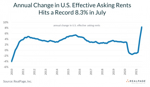
This methodology has almost certainly drastically understated housing cost inflation, particularly since 2000 when, as we saw in Chapter 4, home values began to far exceed the CPI. Since shelter costs are around 40% of the CPI, this is highly significant. Post-Covid, this approach created even more divergence versus reality, especially once rent abatements have begun to roll off. Rents were rising at a record clip in 2021, as you can see in the below chart, 17% above the prior lease rate overall.
Figure 7

Figure 8
In summary, most of the factors that have kept inflation subdued appear to be either weakening or outright reversing. This paradigm shift is increasingly looking much more enduring than the Fed believes… or wants the markets to believe. Yet, long-term treasury bonds are trading at the most negative yields since the 1970s, implying investors are buying into the Fed’s transitory inflation meme.
Figure 9

Figure 10

As a result, even though bond yields soared from their 2020 lows (around 0.50% on the 10-year T-note), for the first time since 1981, I was not impressed. Even when the 10-year hit its recent peak of 1.75% in the spring of 2021, it was hard to muster any enthusiasm for that puny yield; however, it did rise sharply in price, lowering the yield to 1.25% by late August of 2021. Accordingly, it was, as they say, a tradeable rally. But I have a hard time playing that game, especially when there are myriad inflationary winds beginning to blow, even howl.
As recently as late 2018, when the Fed had been raising rates for several years, the 10-year T-note yield moved about 1.2% higher than inflation — 3% versus roughly 1.8% inflation. It was also possible to get close to a 5% yield on investment grade corporate debt, generating an even more positive real return. (My team and I once again used this bond selloff to extend the maturities of our clients’ bond portfolios, something I have done in every bond bear market since the early 1980s. Now, however, I am beginning to wonder if I’ll ever get this opportunity again, based on current Fed policies.)
As 2019 unfolded, the yield curve (the difference between short-term and long-term rates) became inverted; in other words, short rates moved above longer rates. This is an unusual occurrence, but it does happen when the Fed has been tightening for an extended time and the bond market begins to sniff out a slowdown or, usually, a recession. In fact, an inverted yield curve is one of the best recession predictors around — far better than the Fed, which, once again, has failed to warn of a single economic contraction. (Since WWII, there have been nine yield curve inversions and eight of these were followed by recessions in relatively short order. Thus, the yield curve’s batting average has been .889 versus the Fed’s at .000)
This warning signal worked once again; in mid-2020, the National Bureau of Economic Research (NBER), the official recession arbiter, declared that a contraction had begun in March. This confirmed the recessions in corporate profits and industrial production that was already underway in 2019. (Of course, the Fed failed to anticipate its arrival in any of their press conferences and even in their internal meeting minutes, at least those that have been released thus far, on the usual delayed basis.)
Unquestionably, Covid turned what was likely a mild contraction into one of the deepest ever; however, the NBER has now determined it was also the shortest. According to its analysis, the Covid recession ended in April of last year (other sources opine that it lasted for three months; regardless, it was exceptionally short-lived). This coincided with the briefest bear market in stocks ever seen.
As mentioned in Chapter 2, it was the Fed’s announcement in late March of 2020 that it would buy corporate debt which triggered the furious bull market and ended the Covid recession, despite the on-going lockdowns. Again, this fulfilled one of my most far-fetched predictions: namely, that the Fed would bring down credit spreads during the next crisis (however, it also stated it would buy junk bonds, which I didn’t expect).
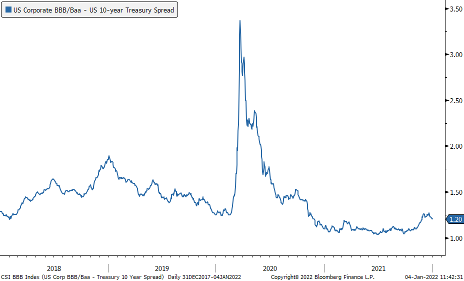
Ironically, and also as I speculated as far back as 2008, it actually didn’t need to purchase large quantities of corporate bonds to cause credit spreads to collapse. By the time the program was closed down by the Treasury Department at the end of 2020 — over the Fed’s objections — a mere $14 billion was actually acquired. This is in contrast to the $5 trillion the Fed has bought, via its Magical Money Machine, of U.S. treasuries and mortgage-backed securities since the pandemic hit. Just the idea that the Fed had the corporate bond market’s back was enough to produce the credit spread plunge seen below. (Falling corporate spreads mean that private-sector bond prices are rising relative to Treasuries; this process has an extremely powerful and beneficial impact on asset prices, as well as borrowing conditions.)
Figure 11
Consequently, as 2021 drew to a close, a bond investor was faced with a situation 180° removed from the time in 1981 when I first became a bull on bonds. Instead of a real rate of return far above inflation, investors were facing yields that lose money each and every year, even if the Fed’s 2% inflation target can be maintained. If I’m right, and we’re facing much higher consumer price increases than that, bonds will be “certificates of confiscation” to a degree they haven’t been since the 1970s.
Similarly, corporate spreads are down to levels that offer little compensation for default risk. This is particularly true with junk bonds which now, for the first time in history, also have negative real yields. (Obviously, junk bonds have far greater default risk than investment grade debt but even the latter sometimes go belly-up.)
My love affair with the bond market has been a long and blissful one. There were times when I would briefly jilt it, such as late in an economic expansion as inflation was heating up and the Fed was just beginning to tighten. But this time is different — very, very different, in my view. Those are always dangerous words to utter in the financial markets. But, then again, when was there a time, outside of war, when the U.S. government was engaged in Modern Monetary Theory?
In Chapter 9, we will examine an inflationary force that, in my mind, has the potential — in fact, I’d say probability — of being the greatest of them all. Moreover, it’s one that very few pundits and financial narrative-spinners are discussing.
[i] Bond prices and yields are like a teeter-totter. When prices fall, yields rise and vice versa.
[ii] Oddly, when the Fed has been on long tightening campaigns and rates have risen considerably, most bond investors are typically reluctant to extend “duration”, a fancy way of saying buying longer maturity debt. This reluctance costs them dearly in terms of forfeiting the opportunity to lock in high yields for years to come.